
The keys to the interior design of the bakery La Madrugada by Javier Moreno

Dreamlike, surrealism, craftsmanship... are some of the concepts conveyed by the interior design signed by Laura Ortín.
Laura Ortín, founder and director of the Laura Ortín Architecture for Happiness studio
Javier Moreno, technical director of the National Artisan Bakery Selection (Los Espigas), undertook his most personal project in 2019: La Madrugada, a signature bakery in Beniaján, very close to the city of Murcia. An establishment that transmits the passion that is lived in the bakery, not only through its range of products, but also through the interior design signed by Laura Ortín's studio.
Ortín, an architect and lecturer on the Master's Degree in Interior Design, Decoration and Retail Designer at Instituto 42, designed a shop for Moreno that envelops the customer 360º, in a space that produces calm, tranquillity and wellbeing.
1.- Is interior design a fundamental element in a bakery? Can it be a hook to attract new customers?
Absolutely yes. The product not only has to be good, it has to look good, and in this the space, how it is produced, how it is displayed and how it is sold, is key.
The design of a specific space for a specific product and trade has a huge impact on sales success. With the right interior design, analysing what the keys are, what we want to achieve and how we are going to achieve it, the miracle of seducing the customer is produced. With organisational strategies, channelling efforts (economic investment and time) and using architectural design resources, the space provokes a total attraction in the customer's experience.
2.- What are the keys to making the design of a store work?
In the studio we give equal importance to two things. On the one hand, the well-being of the workers. These people spend most of the day in these premises and we are very concerned that they are comfortable. That there are no less attended areas, and that it is just as beautiful where the public is as it is in the "back room". That they are comfortable spaces, easy to move around, to maintain and to organise. Because if an employee is at ease in his or her workplace, this will be reflected in the relationship with colleagues and in customer service, so we must never forget that part.
On the other hand, the customer experience. We care a lot about those first three seconds of visual impact that the visitor receives when he or she first arrives in the shop. The smell, the sound, the order and the emotional atmosphere that brings back memories of something good. Afterwards, that person will visually go through the shop and pay attention to certain details that they have never seen before and it is then when they understand that the product they are going to take away is something unique, handmade, made with care and attention to detail. And they will return to the shop and recommend it, for the product, of course, but also for the space, because they will have enjoyed shopping there, because it will have been a complete experience.
3.- What are the current trends in the design of bakeries? Luxury? Functionality? Modern, rustic, urban?
Fortunately, more and more bakers have realised the importance of their premises and workshop reflecting their values. If a product is good, you have to sell it as it deserves to be sold. The first impression is fundamental, the attraction, the attraction, that first opportunity. For this reason, bakeries are already being designed by professionals who attend to all these issues. Moreover, what is happening is that you have to stand out from the rest, what is it that you offer that is different from your colleague two streets down? That's what we specialise in, making your shop one of a kind.
We consider ourselves to be contemporary to the core and we try not to get carried away by trends, but to create the trend at any rate. And we like to think that our projects are difficult to label with a single adjective. The key to achieving this is to pay specific attention to those values I was talking about before: if your product is handmade, you can't sell it in a space with an industrial aesthetic. If your product is local, don't imitate a boulangerie. But if your product is avant-garde, then your space must be avant-garde, find out how through a professional who will give you the tools to achieve it.
For example, what is luxury? For us "luxury" does not mean unattainable, on the contrary, luxury is being able to buy a delicious croissant in a pleasant and beautiful space and sit on a bench in the sun to savour it. Or to take a loaf under your arm for dinner with friends. It's as simple as that.
Functionality? Always. Sometimes we struggle to find the balance between innovation and practicality, but we work hard and think hard to achieve the right mix of both.
Success story: La Madrugada
When creating the interior design, we wanted to do something just for Javier Moreno, a baker who works from the avant-garde recovering tradition. We wanted an identity and a unique space for him.
The idea originated between Javier Moreno and Rubio y del Amo, who are graphic designers. A series of parallel concepts appear around the night, a dreamlike world, the world of dreams. They speak of craftsmanship, of the manual, of the collective imaginary of the traditional bakery, the baker who gets up early and works at night. Its leitmotiv is: "We make bread while you dream".
A choral work
Javier Moreno thinks that to do a job well done you have to have the right professionals. And that is fantastic, a gift for all of us who make up the project. He surrounded himself with his dream team. First with the graphic designers, Rubio and del Amo, with whom he created the identity. And together with them, they decided to bring in an interior designer and called us. Our mission was to turn that identity into architecture. Then we worked with a fashion designer to create the wardrobe, Constanza Mas. La Madrugada is a holistic product turned into reality in a choral way and that is reflected in the absolute success it is having.
We all worked as one, complementing and supporting each other. That made everything flow and good decisions were made quickly. The project and the work were completed in about nine months.
In fact, we will soon be opening another shop-owner in Murcia and we can tell you that the interior design is totally different, and this is important because specificity is part of the business. Where are you? Who are you selling to? What are you selling?
Dreamlike and fluffy space
From the graphic identity we extracted ideas such as oneiric, surrealism, craftsmanship, dreams, etc.
Then I thought of a spongy dough and a loaf of bread with its hollows and in a way I transferred all these ideas to the space of the shop.
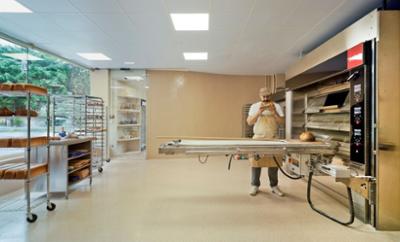
The workshop is a large, spacious room filled with machinery, trolleys with trays on wheels and large, floured tables for kneading. Despite strict health regulations, we were able to realise a kind and new aesthetic. The straight, curved walls were covered with cream-coloured tiles. The floor is traditional terrazzo, a material we love for its strong and durable character and timeless traditional aesthetic.
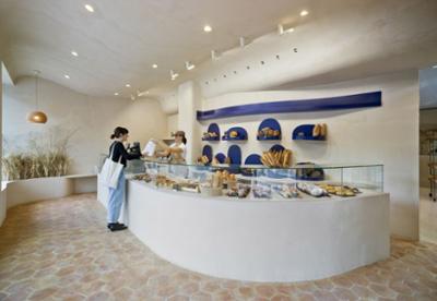
The shop was designed as a shell. Ceilings, walls and furniture form a curvilinear continuum that is manually covered with soft earth-coloured microcement. This dreamlike, somewhat surreal spatiality makes the shop envelop you 360º, its softness, its fluffiness produces calm, tranquillity, wellbeing.
The curved counter welcomes you and slides you through the wide variety of products. A continuous and friendly flow that makes you walk through the shop invaded by familiar sensations and aromas.
The bakery is full of subtle messages that transport us to that world of real-unreal duality. In the background, an invented wheat field, the origin, crowned by a handmade clay lamp. Its lightness is surprising, worked like filigree, with thousands of precise holes that show the light. This space, we can't deny it, is our favourite, it's that corner where you feel at ease, like at home.


