

ARCO presents its colour for 2025


ARCOmadrid and ARCOlisboa 2025 will be using the colour #BFBFFF (Pantone 2705 U) as one of the main graphic elements of their 44th and 8th editions, respectively.
Colour is a great element of design, art, communication and, above all, nature. Colour brings us closer to moods, it clothes us, complements us and is an essential part of the symbolism of the elements that surround us. The fact that colour is present at ARCO is undeniable, not only through the works on display at the fair, but also through graphic elements.
Back in 1982, the first edition of ARCO used the 3 primary colours on its logo. This would become the basis of its advertising design in the following years. In the early 1990s, ARCO’s image and catalogue gradually incorporated different colours into their designs in the projects of the guest countries, for example: red and black in 2004 (Greece), yellow and pink in ARCO 2006 (Austria), pistachio green in ARCO 2009 (India). But it was not until 2017 that ARCO presented a specific colour for the edition: red.
ARCOmadrid red and ARCOlisboa blue
In 2018, colour became one of the main graphic defining elements of the event and would become part of the history of each edition until the present day. The team of designers settled on red for ARCOmadrid and blue for ARCOlisboa, a decision that was expanded - and continues to be expanded - to the posters, catalogues, plans, banners, invitations, tote bags, and many other elements that the fair has designed and produced from its 37th edition to the upcoming: ARCO 2025. However, these two colours have not cohabited alone.
A colour for each edition
Since 2018, a third colour has been added each season unifying the Lisbon and Madrid editions. Apple green, orange, light blue, pink, green, sandy yellow and peach have accompanied us in the past seasons and left their mark on the creativities.
The colour chosen each year has brought us closer to human, natural, artistic and curatorial readings as interesting as the contents, sections and designs of the fair that have changed from edition to edition. The FUTURE section and its green architecture (2018), the clarity of blue in the project inspired by Félix González-Torres (2020), the viscerality of the peach colour in the section dedicated to the Caribbean (2024), or the lavender colour in March and May (2025).
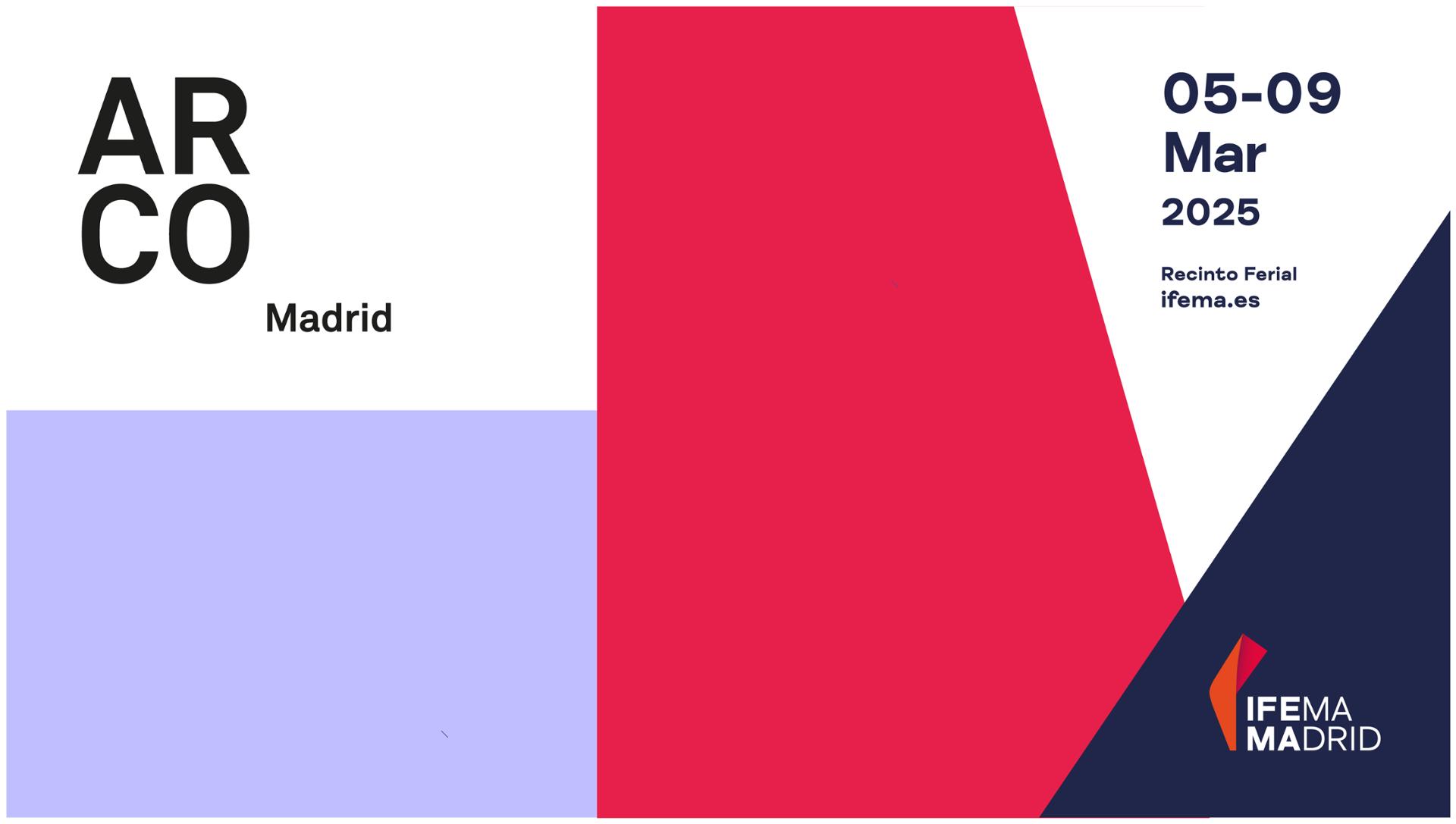
ARCO 2025 - #BFBFFF
ARCOmadrid and ARCOlisboa 2025 will be using the colour #BFBFFF (Pantone 2705 U) as one of the main graphic elements of their 44th and 8th editions, respectively. This pale violet hue will be featured on banners and marquees covering the cities, and collectors, gallery owners and visitors will hold it in their hands as it will also appear on the fair’s catalogue, postcards and tickets. In short, it will remind us that ARCO is coming and art is all around us.
But this colour has a further significance. It is the shade that fills the streets of Madrid in March, when the sunset paints its buildings in light violet, and that of the jacaranda flowers that bloom each May in Lisbon.
ARCO welcomes its 2025 colour!